Electronic charts are amazing. Really they are. They give you so much detail, and when connected to the other instruments on your boat they can give you a level of situational awareness that is far better than anything you can get with your eyeballs alone. Of course there are always dangers. One often discussed problem is how easy it is to get into “Video Game Mode”, where you get fixated on what’s on the screen and not looking around at what’s in the world. A less discussed problem is when the electronic charts you are relying on are just plain wrong.
These examples are from Navionics Charts. All of the data was (according to Navionics) up-to-date as of 4 days ago. Maybe it is not fair to pick on Navionics. Maybe the other brands have similar problems. Unfortunately for Navionics, I bought their product, and I expect it to be better than it is.
Example #1–Sandy Point, Great Abaco Is., Bahamas
Here is one with lots of obvious errors, that I can personally confirm actually are errors because I have been here many times. First, a screen capture of the chart information as it is presented by Navionics. Before you scroll down, see if you can identify the errors…

It’s a little subtle–at first. But once the errors are pointed out they become glaring, at least to a careful sailor. Let me circle them for you:
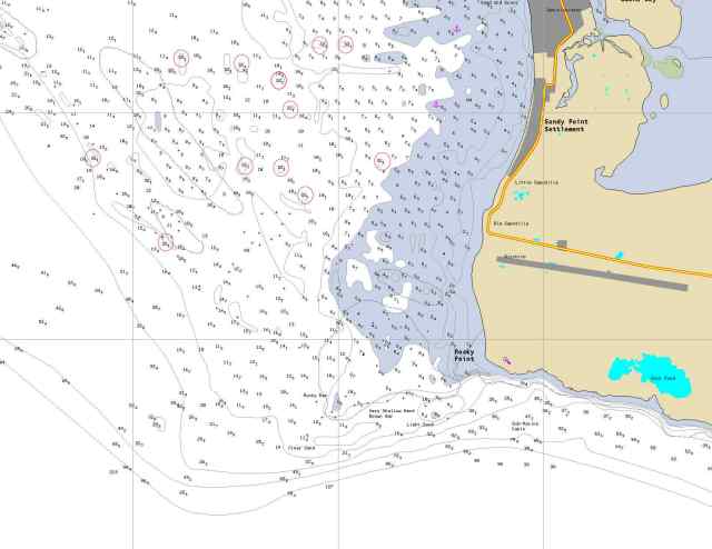
Each of the dozen circled soundings is exactly the same odd number: 32.1 feet. Each of them is improbably deep given that the surrounding soundings are all between 6 and 12 feet. And there are NO examples of any intermediate depths. No 31.9, No 28.4 Having been over this patch of water many times, paying very close attention to depths, I can assure you there are NO 32.1 foot deep spots in this patch of water off Sandy Point.
Now, I assume that Navionics employs at least a few professional cartographers, at least I hope they do. Yet these data have obviously not been reviewed by a human eyeball connected to a human brain. Somehow their data importing and processing has a glitch in it that drops these random depths onto the chart. I don’t know about anyone else, but I find there more than a bit scary.
Example #2–Mobjack Bay Channel, Virgina, USA
This one is a bit different, and an example of a different kind of problem. Navionics claims on their website to “make around 2,000 updates to Nautical Chart every day!” Wow, that’s impressive. I am not sure WHAT they are updating, but just in the last two days we have found MULTIPLE errors in the Navionics charts–every one of which was correct on the current versions of the NOAA official charts.
Now, the NOAA charts are, like all USA government publications, free of copyright restrictions. It seems to me that the very MINIMAL level of corrections I should expect is for the Navionics to be at least as good as the NOAA charts since they can just copy that data!
Here is the picture of the current, updated Navionics chart:
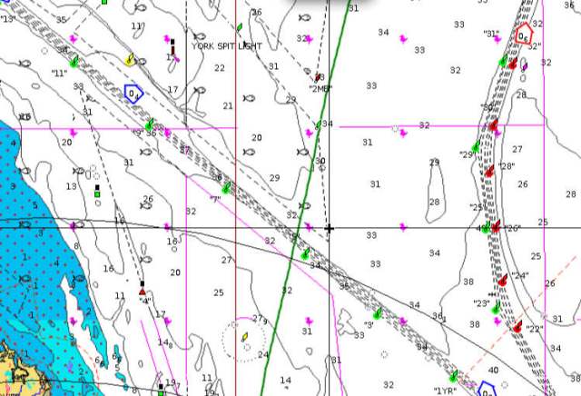
Mobjack Bay, Virginia according to Navionics
By the way, that bright green line down the middle of this image? That was our sailing track yesterday. So we had actual eyeballs on these. Now here is the current version of the NOAA chart I accessed online this morning:
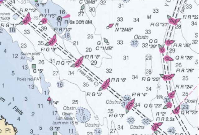
Mobjack Bay, Virginia according to NOAA
By my count there are SIX buoys that are present on the NOAA chart, and missing from the Navionics data, and ONE that is present in the Navionics data, and missing from the NOAA chart. In every case the NOAA chart agrees with my eyeballs. As I wrote earlier, this is not the only case of this. The first time I noticed this discrepancy was two years ago, so it is not a case of simply lagging a bit behind the official chart update cycle.
What is interesting, is it is obvious that Navionics copied the NOAA data originally. You can see the depth contours match exactly. Then they seem to have neglected to follow changes after that.
An unanswered question for me is if C-Map charts (Navionics biggest competitor in the USA) are better? or do they have problems that are just as serious but different???
